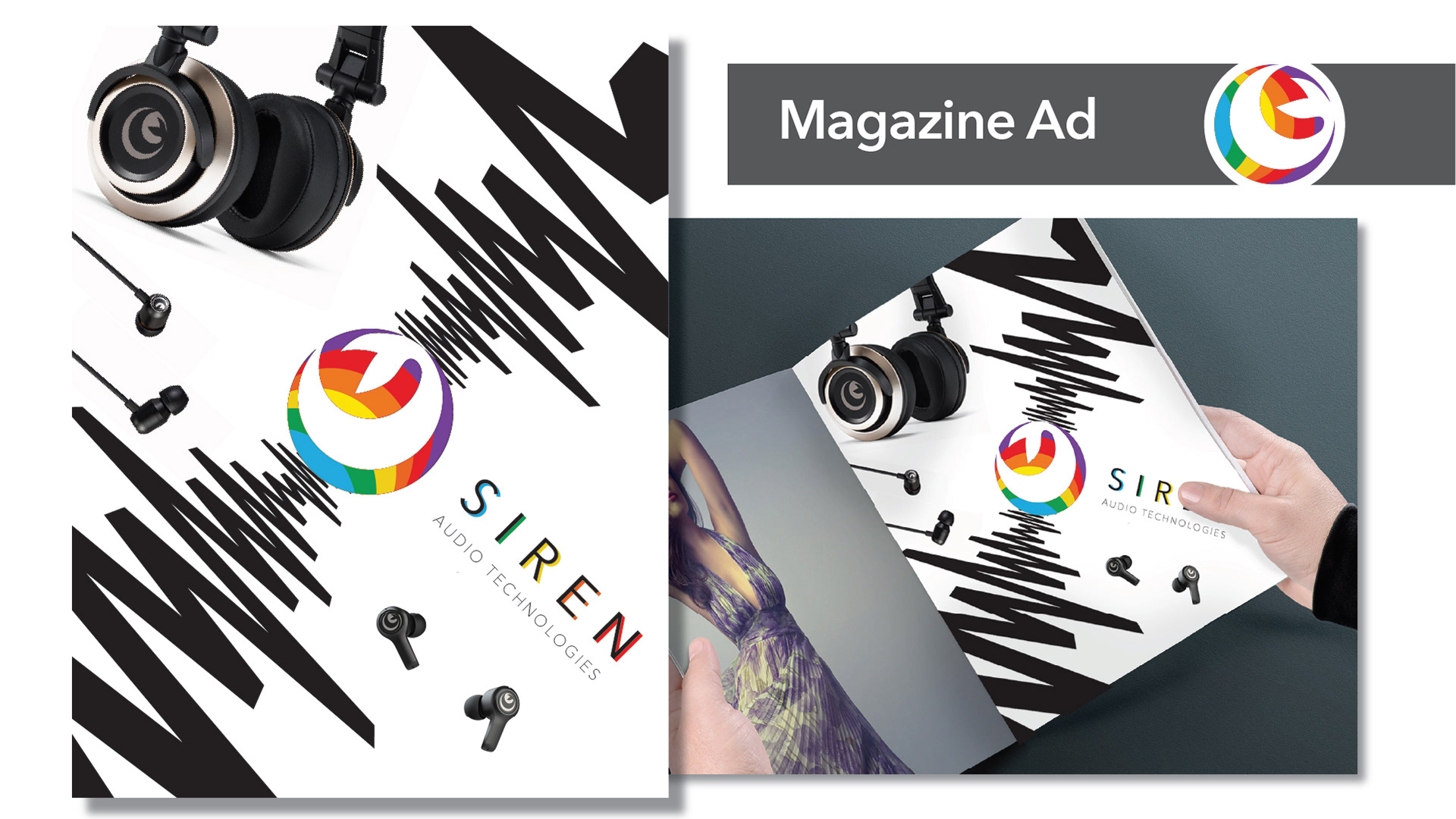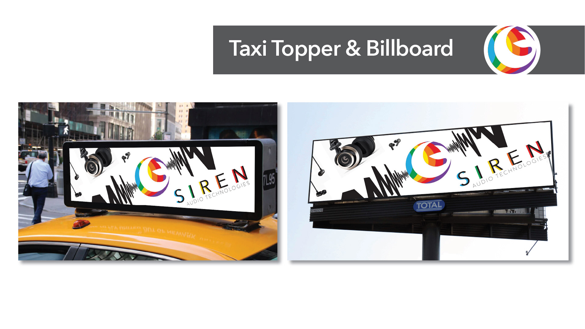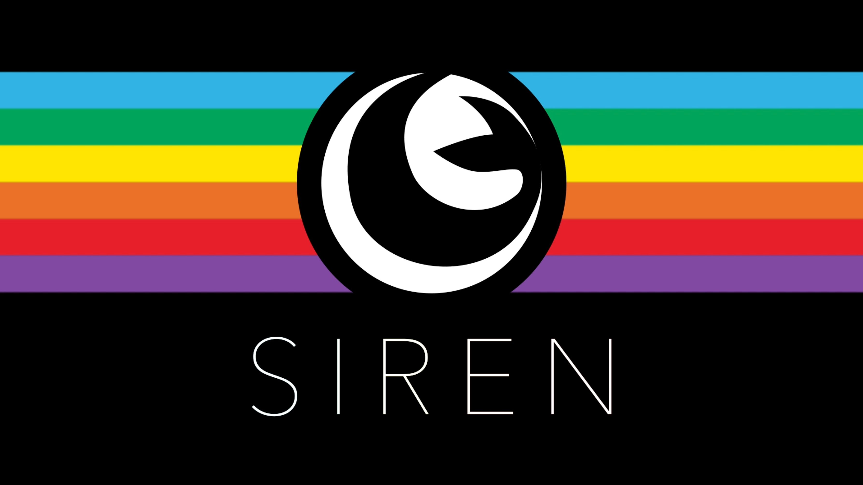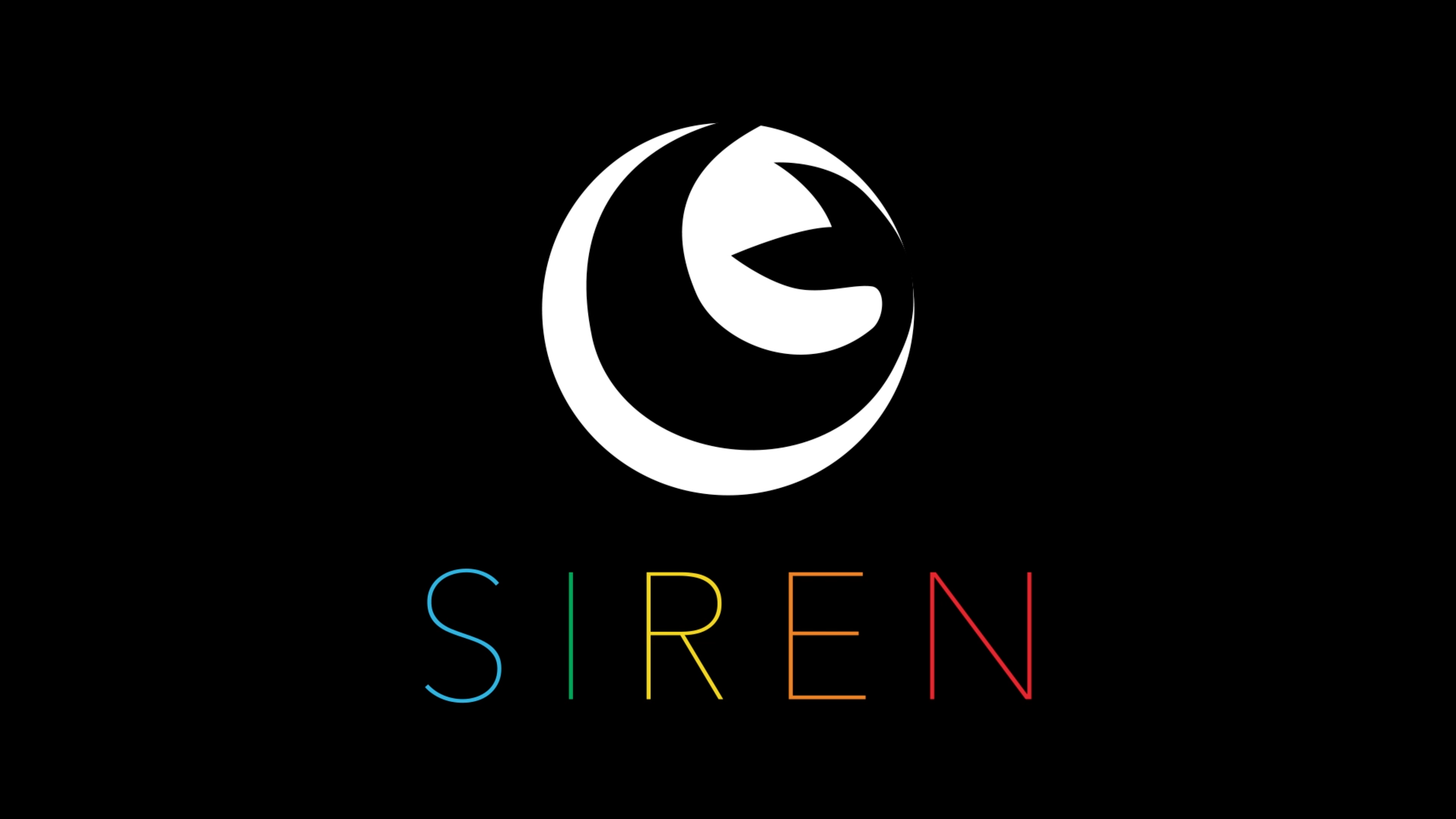
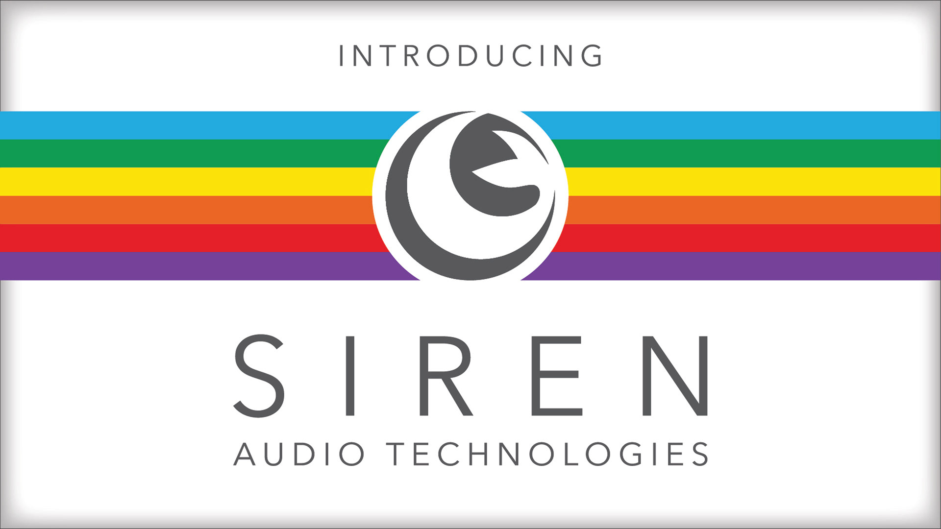
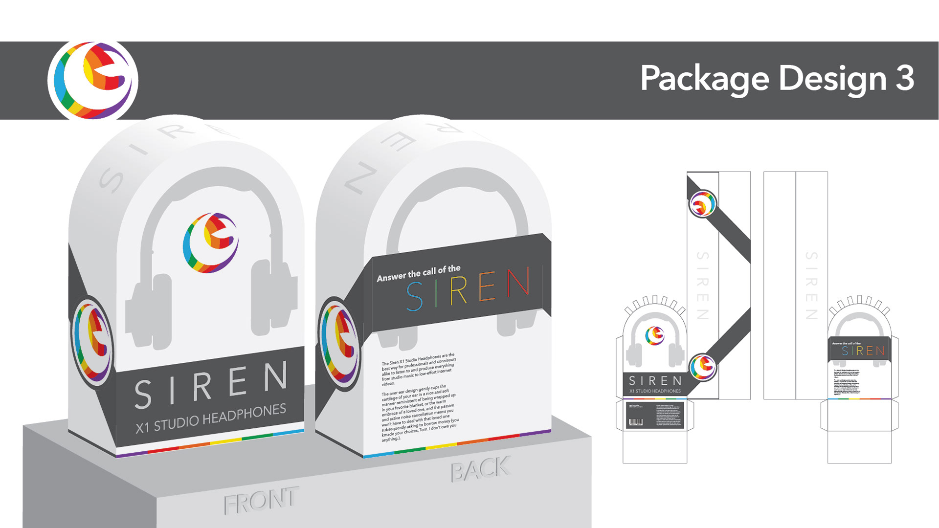
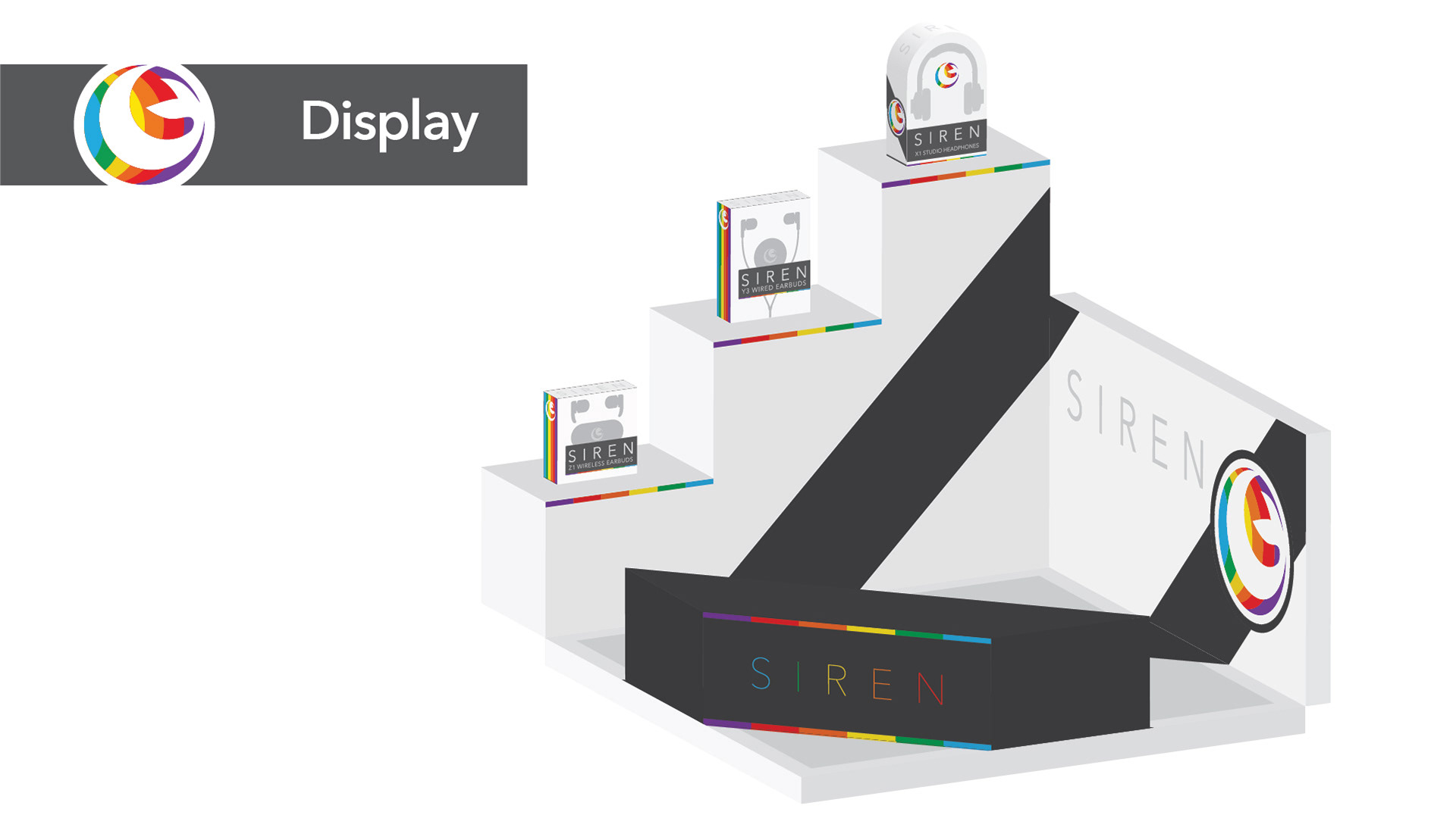
Siren Audio Technologies is a fictional company of my own creation that I built the complete brand identity for, including stationery, package designs, display space, magazine ad, and even images suited for taxi toppers and billboards.
When researching the market space for my audio company, Siren, I discovered that the majority of brands stick to very simplistic branding; sans-serif fonts, a monochromatic approach to color, and logo marks that are largely identifiable by their pictorial elements. I elected to follow suit regarding some of these trends and break others in favor of ideas that I found more visually interesting, and intended to evoke a greater sense of design importance in the product than many brands in this market space often do.
Siren’s logo and typeface are simple, yet elegant and memorable. I wanted to give the product a premium feel, while still retaining the accessibility that could appeal to more than premium markets.
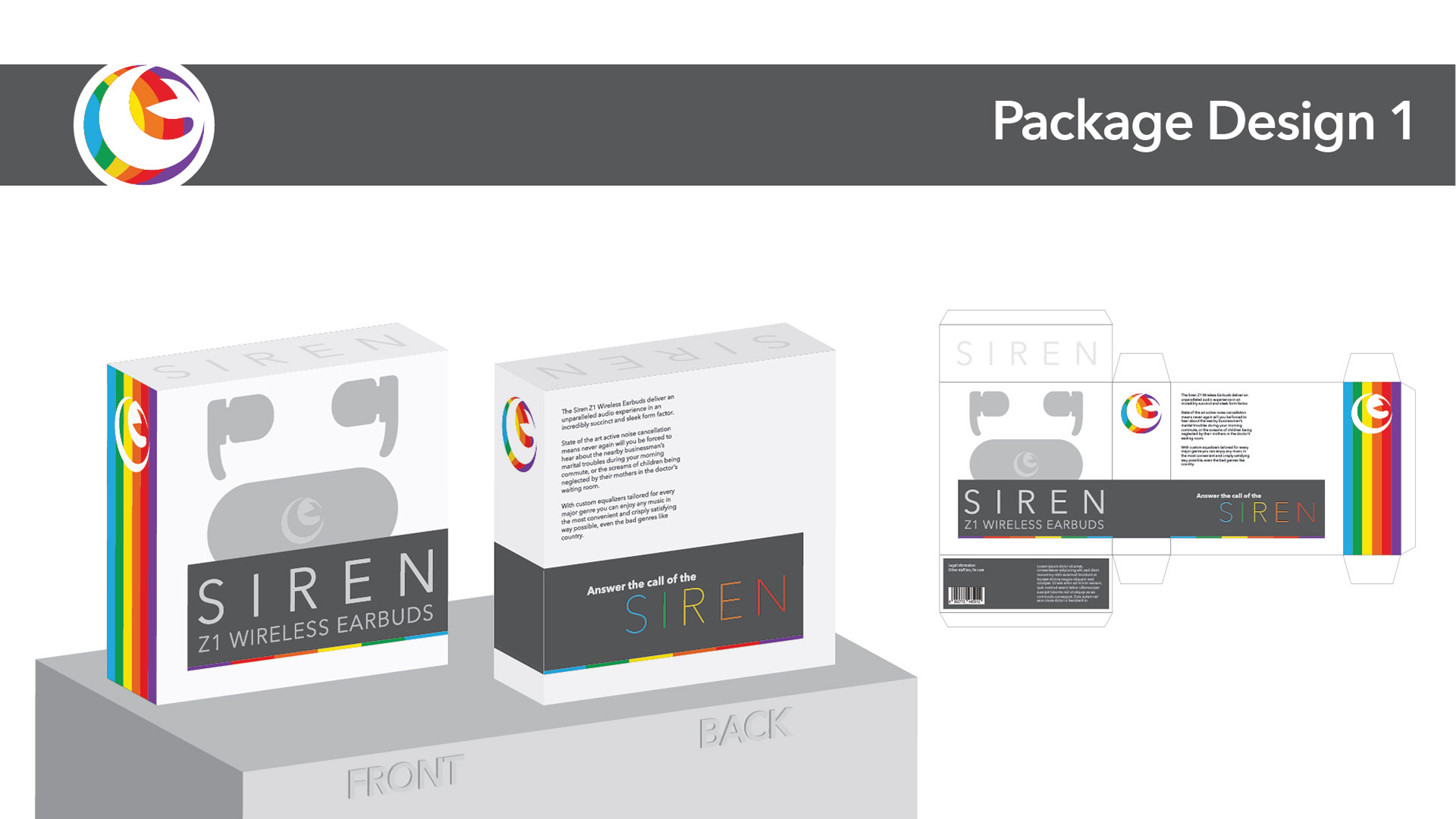
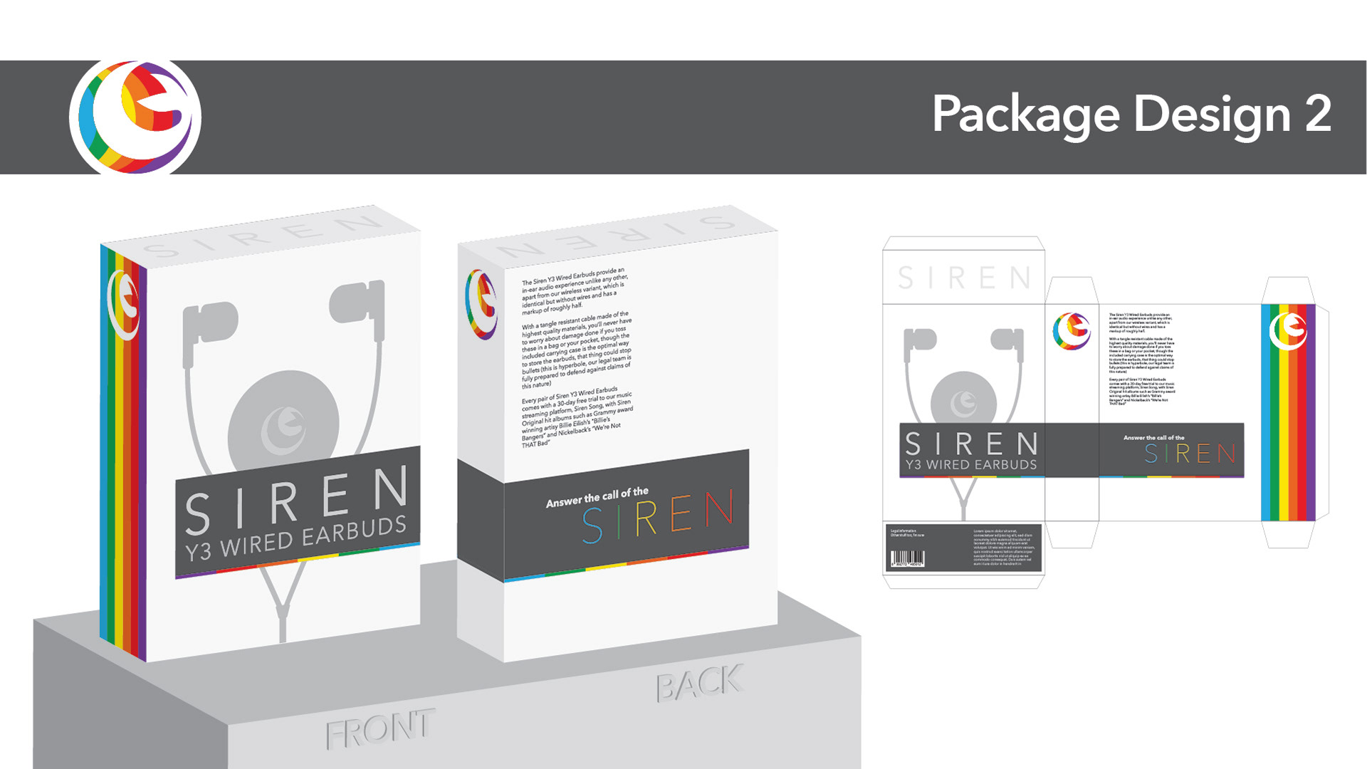
Package Design
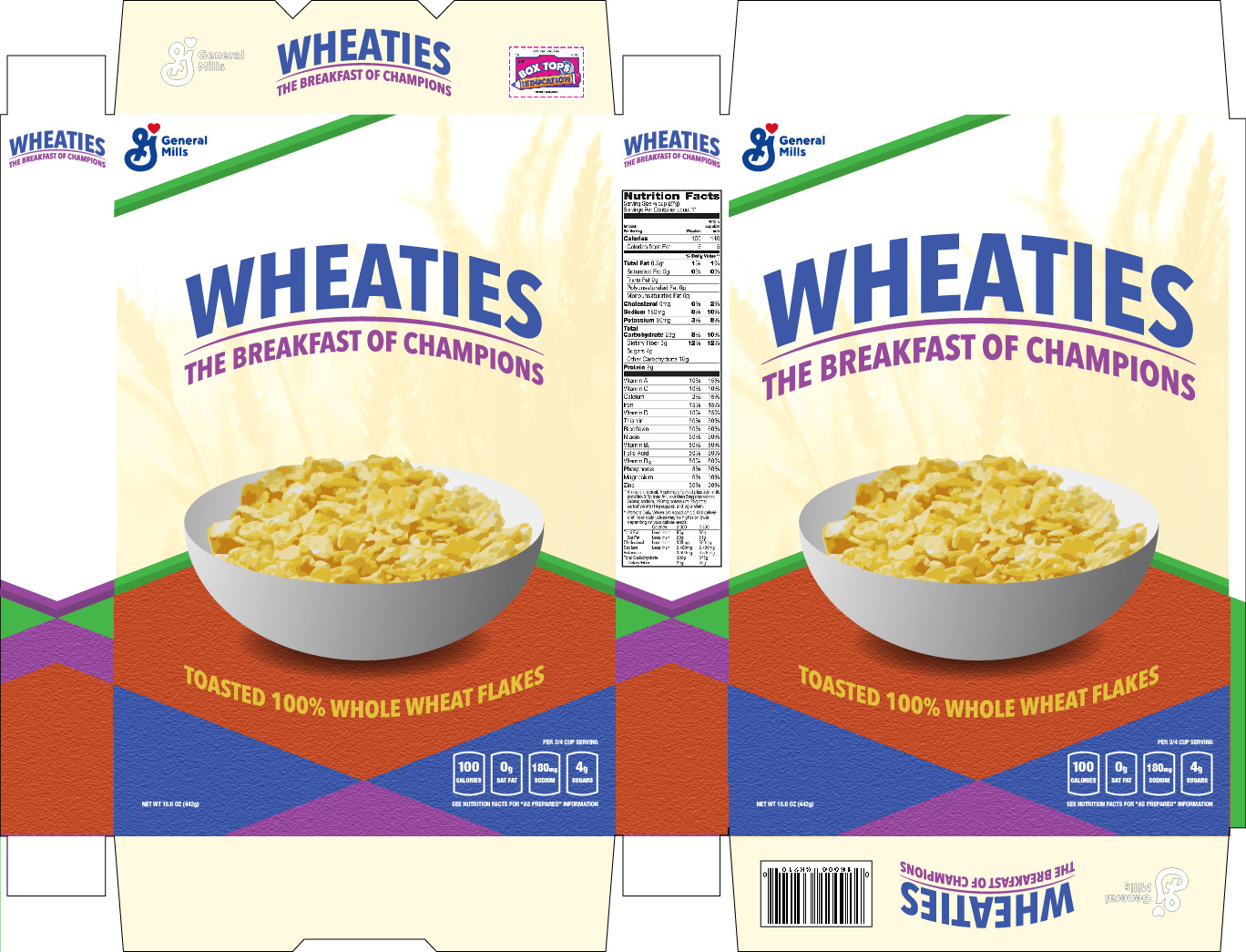
Lets take a break and look at some cereal real quick
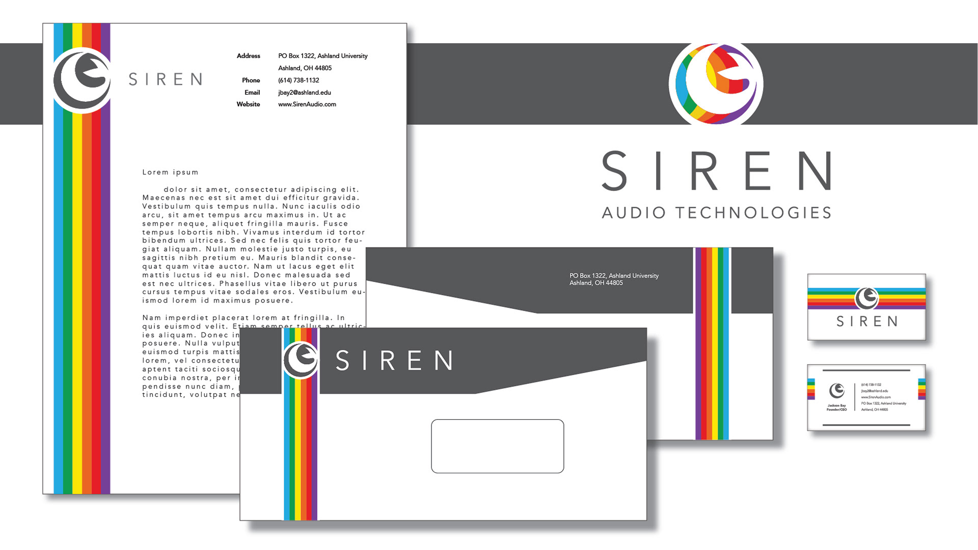
Layouts